The Creative
Process of
Putting
Juice & Tea
Into A Box
Branding and Packaging
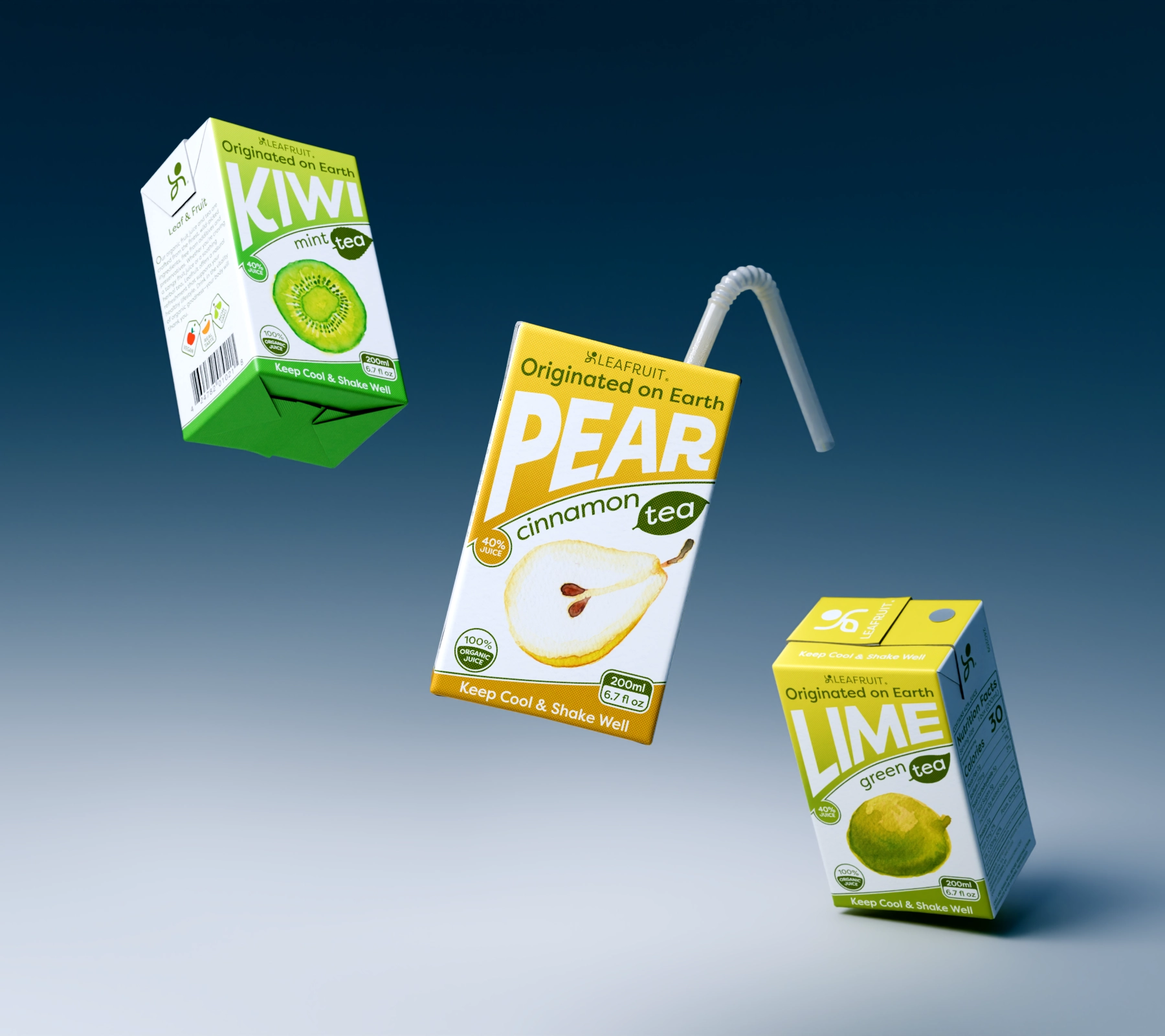
The Brand
Leafruit is designed for young, active adults who thrive in nature's purity and love outdoor adventures. Our refreshing tea and fruit juice, perfectly blended in a convenient box, bring out the vibrant energy of your true youthfulness. We believe in nourishing both the body and the planet, carefully sourcing our ingredients to ensure they are fresh, sustainable, and full of Liveliness.


