A
Clever
Logo
For a
Lavish City
Tourism Logo


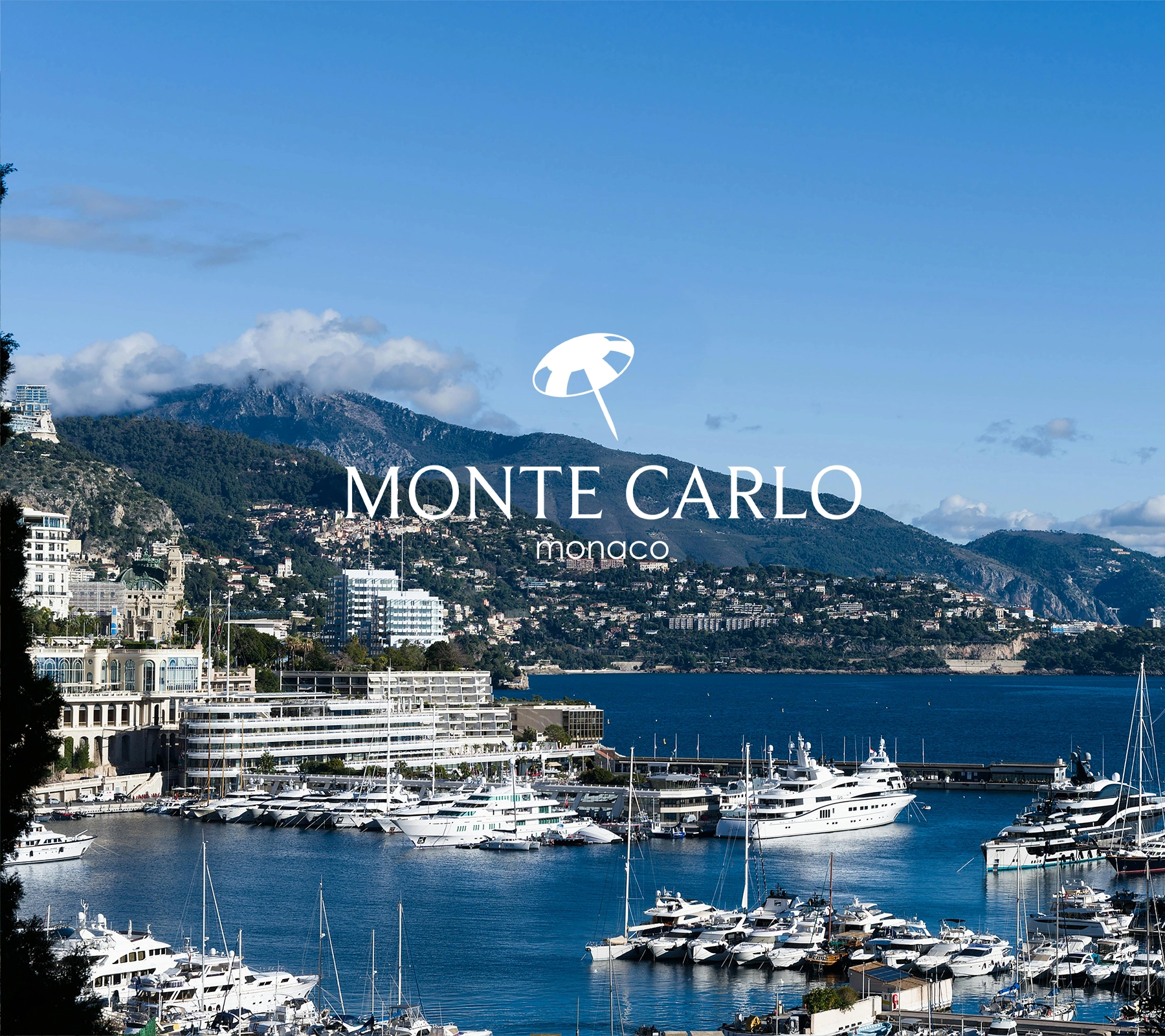
Along the French Riviera lies Monte Carlo, Monaco, renowned for its luxury lifestyle, the Casino de Monte-Carlo, and glamorous events like the Formula 1 Grand Prix. It attracts visitors with its stunning Mediterranean coastal views and resorts.


After research, brainstorming, and sketching, I developed multiple logo concepts with strong designs and meaningful connections to the city.
Ornate lamps are scattered throughout the city streets, providing both lighting and a unique atmosphere, making them a prominent feature of the city.
Located on the Mediterranean coast umbrellas have become a common sight. Given the history and significance of the grand casino, a poker chip combined with an umbrella’s canopy makes for a fitting and unique combination.
Palm trees are scattered throughout the city and can often associate with wealth. Monaco gained its prosperity through the grand casino, and the image of a poker chip combined with a palm leaf represents this connection.
I chose the most visually unique logo to make it distinctly representative of Monte Carlo.
To create a proportional logo, I designed a geometrically accurate umbrella while referencing a poker chip.
Smoothing the shapes with curves enhances the logo’s elegance. This softens the overall design, making it feel more inviting and visually balanced.
I needed a typeface that would pair well with the logos round a sharp characteristics. Beaufort was an ideal choice, with its smooth and sharp letterforms giving a elegant yet unique visual.
Century Gothic balanced visual elements from both the logotype and logo desig maintained a cohesive aesthetic.