The
Swell Ceptor,
A New
Surf Watch
with Nostalgia
Branding and Product
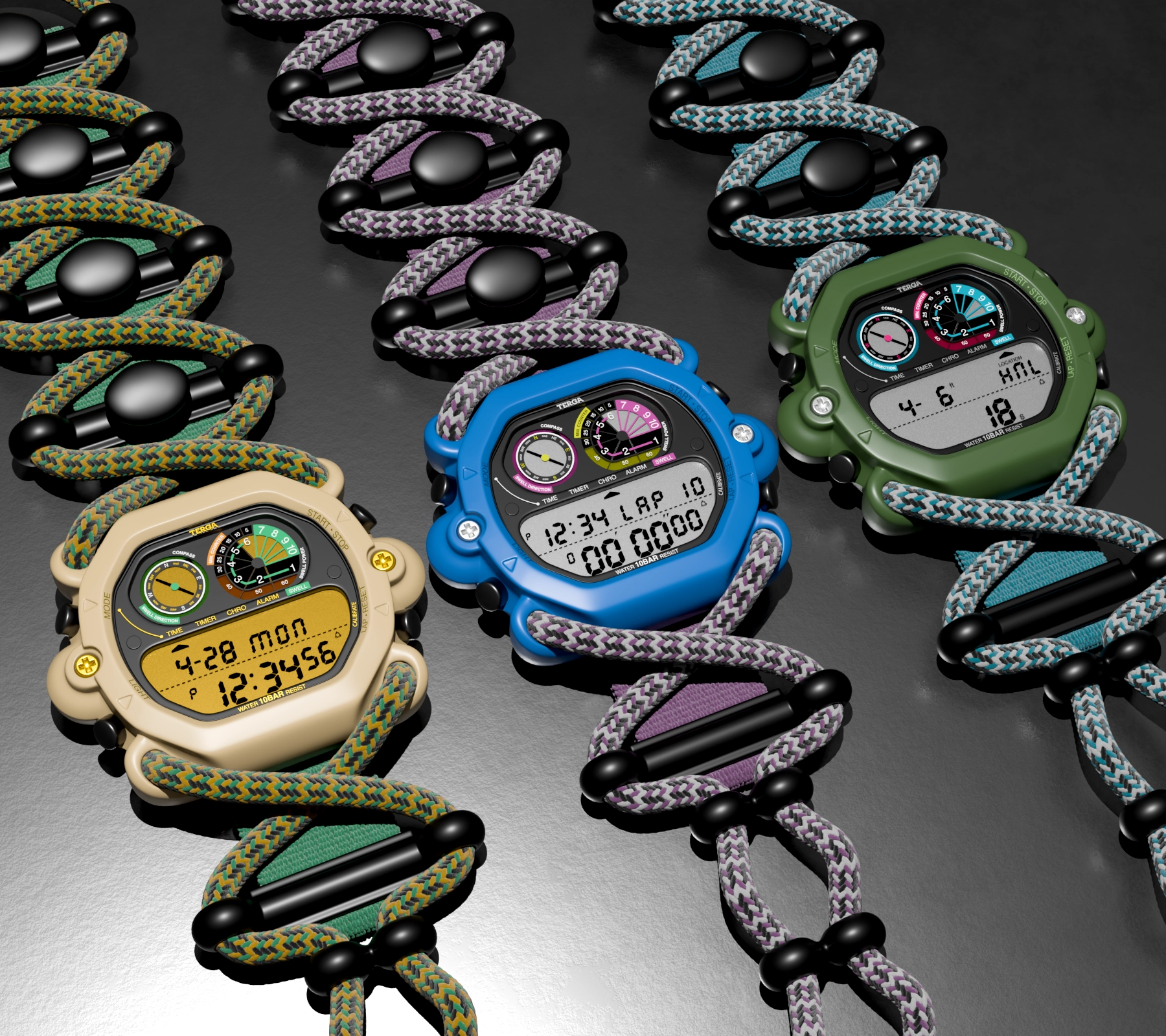
Terga embraces innovation and bold design, exploring uncharted territory to create brazen, surf-oriented gadgets. To evoke a sense of nostalgia, the brand reimagines vintage technologies, bringing them into the modern era with experimental design.


After extensive sketching and iteration, the final design was achieved by combining the best elements from each concept. The final result is a watch that is not only visually striking but also functional. The design process was a difficult tug of war between design and functionality, resulting in a product that captures the starting goal.


Drawing inspiration from the skeletal structure, I designed a band that threads through the watch and wraps securely around the wrist using the elasticity of paracord.

Paracord is known for its durability and elasticity, making it ideal for a secure fit and easy adjustability. A custom thread pattern allows for unique color combinations, adding a distinctive visual element to the design.

In order to maintaine the structure of the band, a high-density polypropylene webbing keeps it together while mainting flexibility.


Solid segments were secured along the webbing to guide the paracord along its path.


The main limitation a liquid-crystal display, is its fixed physical structure. In LCDs, elements like numbers or icons are permanently embedded and correspond to predefined shapes that are activated using electrical signals. Unlike graphical displays, these elements can't be altered or repositioned.


It was important to ensure that the layout looked good in all modes—both information-heavy and minimal. It was also important to create an easily understandable layout that clearly presented key information through visual elements such as a compass visualization, a seconds graph, and a swell power meter.

As a watch brand, it's important to use a typeface that feels elegant—but in this case, a more modern look was also necessary, so finding the right balance between the two was essential. Novecento Slab hit the mark, but needed some modification to better fit the brand’s brazen design aesthetic and improve the legibility.
The challenge in creating segmented digits and letters is maintaining their leading and legibility across the many randomly generated combinations within words and numbers.

To address this, I incorporated a large beveled edge into each cluster. This helps guide the eye along the shape of each number. The bevel softens the mechanical feel of segmented typography while maintaining structure.

The letterforms share the design language of the digits, with slight adjustments to enhance legibility and spacing. The constraints of the seven-segment structure posed a significant challenge to accurately depicting certain letters.
I needed a typeface that would pair well with the logotype and wouldn't clash with the Seven-Segmented display. Helvetica was an ideal choice, with its clean sans-serif letterforms didnt look to distracting and set neatly into the layout.
Drawing inspiration from natural color hues found in oceanic and coastal regions resulted in a unique color palette.
The warmth of earthy tones of desert rocks, green water, and the natural greens of desert plants and cacti.
The exciting clash between deep ocean and the vivid vibrancy of a shallow coral reef.
The coldness from dark green kelp, accented by the vibrant colors of crustaceans.